Running successful LinkedIn ad campaigns depends on multiple factors.
You’ll want to make sure that you’re targeting the right audience with an offer that is compelling to that audience.
But even with a compelling offer, grabbing your audience’s attention in today’s world of information overload is easier said than done. That’s why it’s vital to invest time and resources in the creative elements of your campaign as well.
Too often, advertisers invest significant amounts of energy and ad dollars into their offers and ad spend while treating creative as an afterthought. The result is lackluster click-through rates, high CPCs, and missed opportunities.
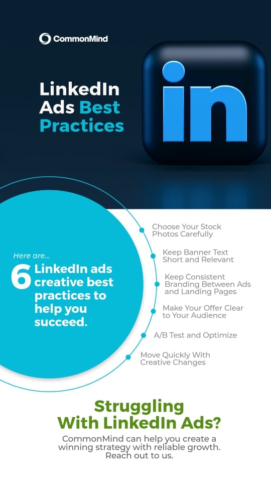
To help improve your ad creative and campaign results, here are 6 best practices to keep in mind.
#1 – Stick to High-Quality Photos
Photos, especially of people and faces, can help create emotional connections that draw users to engage with your ads. Most advertisers cannot procure custom photography for each campaign, and therefore they leverage stock photos instead.
Stock photos can be effective. However, you’ll want to stick with high-quality and unique images. Go for photos that both look unique and communicate the idea or emotion you’re trying to convey.
Another way to stand out is to inject custom elements into your imagery. For example: If you don’t have a designer on staff to do this for you, tools like Canva give you a do-it-yourself option.
Also, a note about free stock photos: some are truly great, but avoid photos that are outdated even if they are otherwise of decent quality. Fashion and technology have changed rapidly over the last ten years, and the free stock photo sites are flooded with images with older phones and more formal office attire that’s less common in many modern work environments.
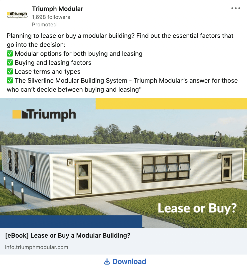
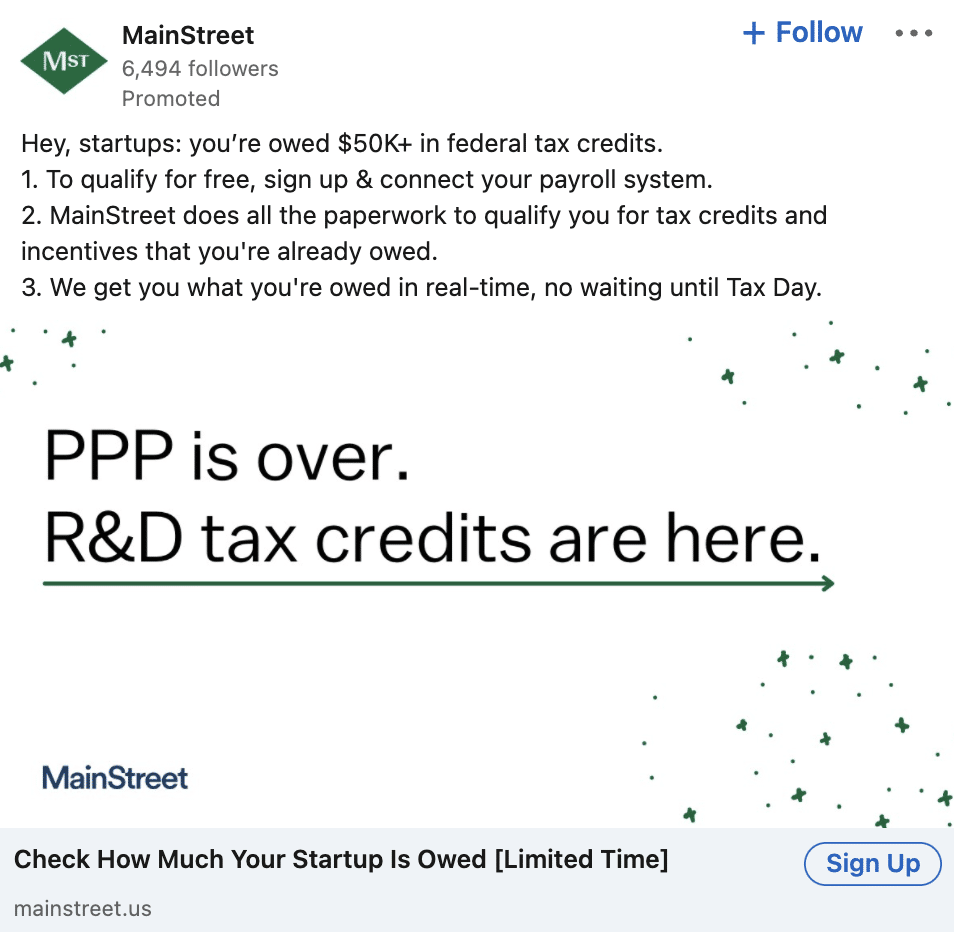
Example ad that demonstrates an engaging use of a photo.
#2 – Keep Banner Text Short and Relevant
LinkedIn ads tend to perform best when banner text is kept short and relevant.
AJ Wilcox, host of The LinkedIn Ads Show podcast, makes a fantastic point about banner text: If you’re driving past a billboard on the highway and there’s a wall of text on it, chances are you won’t be able to read it, and by extension, won’t take anything away from it.
Similar logic applies to LinkedIn ads. It’s best to keep your banner text short and sweet. The billboard rule says you should limit yourself to 7 words or less.
Remember, ads on LinkedIn contain introductory text, a headline, and a call to action, in addition to an image. Therefore, it’s not even absolutely necessary to overlay text on the image you choose for your ads.
We like experimenting with text-free images because they make ads look more similar to organic social posts and are less prone to being ignored due to ad blindness. i.e., our internal filter that notices and scrolls past ads without our even realizing it.
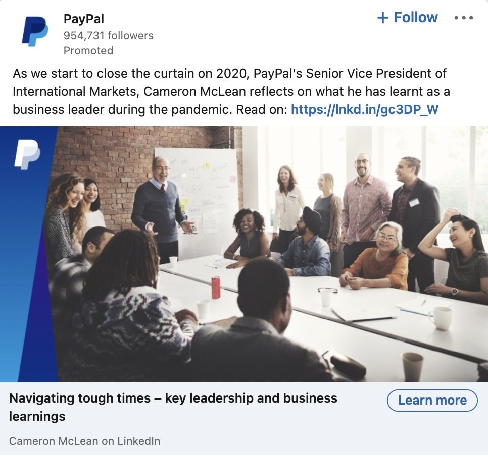
Example ad which follows the billboard rule of limited text on the image.
#3 – Maintain Consistent Branding and Messaging Between Ads and Landing Pages
When a prospect clicks on your ad, they should feel like they’re in the right place. The user should clearly understand that they’re receiving the same offer that they clicked on.
To achieve this, keep your messaging, branding elements, and design principles consistent between your LinkedIn ads and your landing pages. Things like color schemes, imagery, and logos can help you maintain a consistent brand look.
#4 – Make Your Offer Clear to Your Audience
Most people are short on time. If they have to guess what you’re offering with your ads, there’s a good chance they’ll just keep scrolling.
Tell your audience exactly what they’re getting out of your offer.
For example, if you’re offering an eBook, add “eBook” to your headline and/or your introductory text. This clearly shows the prospect what your offer is about and what they’re going to get if they click on your ad.

#5 – A/B Test and Optimize
Testing your ads is not only a crucial part of a successful LinkedIn Ads strategy, but it’s also a straightforward process.
To A/B test your ads, switch out certain creative elements while keeping everything else the same. For example, if you run the same banner image with two sets of headlines, you’ll immediately have two ads to test against each other. Similarly, you may test two images with the same introductory text and headline.
When A/B testing, it’s important to understand which metrics are valuable to track depending on the ad’s place in the funnel. The most important metric to optimize for ads is often the click-through rate.
When measuring the results of an A/B test, keep the concept of statistical significance in mind. Depending on how close the results are, you may need many more ad impressions before a true winner can be declared.
ABTestGuide.com provides a useful calculator for this purpose. Note, if you’re comparing click-through rates (CTRs), use “impressions” for the “visitors” data and “clicks” for the “conversions” data.
#6 – Move Quickly With Creative Changes
Not every ad you create is going to be a hit.
While this can be discouraging, it’s important that you move quickly with any creative changes. If your creative is underperforming, don’t be afraid to change it up quickly. It’s better than sitting on ads that aren’t meeting your goals, and you’ll spend less in the long run by making a change early.
Here are a few ideas for ad elements you can change if your ads are underperforming:
- If your ad is an illustration or design without a photo, try an ad with a photo instead.
- If your ad contains a photo, try removing any text that overlays the photo, or take the reverse approach: remove the photo and try an artistic design with just text and graphical elements.
- If your introduction text is long, try something short and to the point.
- If your introduction text is short, try longer text with bullets.
- If your headline doesn’t describe the offer literally, add the offer type to the headline, e.g., “Ebook,” “Infographic,” “Free Trial.”
- If you’re already mentioning the offer type in your headline, try hitting a pain point, e.g., “Stop Losing Sales,” “Reduce Customer Wait Times,” etc.
- If you’re using landscape images (1.91: 1 ratio), try vertical (1: 1.91) and/or square images.
Following These LinkedIn Ads Best Practices Can Help You Find Success With Your Campaigns
LinkedIn Ads, when used effectively, can yield a fantastic ROI, but only if your ad creative is efficient at driving awareness, clicks, and conversions.
It’s not only worthwhile to invest time and energy in your creative, it’s absolutely vital to your campaign’s performance. Start by following these 6 best practices. From there, continue to adapt based on what works best for your audience. This will put you and your campaigns on the right track for achieving your goals.
Struggling with LinkedIn Ads? CommonMind Can Help
CommonMind can help you achieve predictable and reliable growth with your LinkedIn Ads campaigns. We can manage everything from the creative to the analytics and beyond. Reach out to us. We’re here to help!
Share this
Twenty Examples of Digital Marketing Ads
Why We Love LinkedIn Ads For Growing B2B Leads